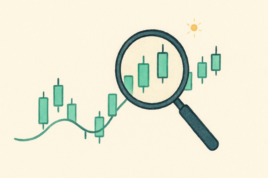
If you’ve ever opened a crypto price chart and felt like you were staring at a wall of red and green boxes, you’re not alone. Learning how to read a crypto chart is mostly about understanding one small shape: the candlestick. Once that clicks, the rest of the chart stops looking like noise and starts telling you a simple story about what buyers and sellers just did.
This guide walks you through it in plain English. No jargon, no promises about predicting the next big move, just the basics you actually need to make sense of what you’re looking at. By the end you’ll be able to glance at a chart and understand roughly what happened and over what stretch of time. If you’re still choosing where to watch prices, our roundup of the best crypto apps for beginners is a good place to start.
How to read a crypto chart: what you’re looking at
A price chart is a picture of what an asset cost over time. The bottom of the chart (the horizontal line) is time, moving from past on the left to now on the right. The side of the chart (the vertical line) is price, low at the bottom and high at the top.
Most crypto charts default to candlesticks rather than a single line. A line chart just connects the closing prices. A candlestick chart packs a lot more into each little shape, which is exactly why traders prefer it. Each candle sums up a whole slice of time in one glance.
Crypto markets run around the clock, every day of the year, so these charts never really “close” the way a stock market does. That’s worth remembering when you see prices moving at 3am.
How to read a single candlestick
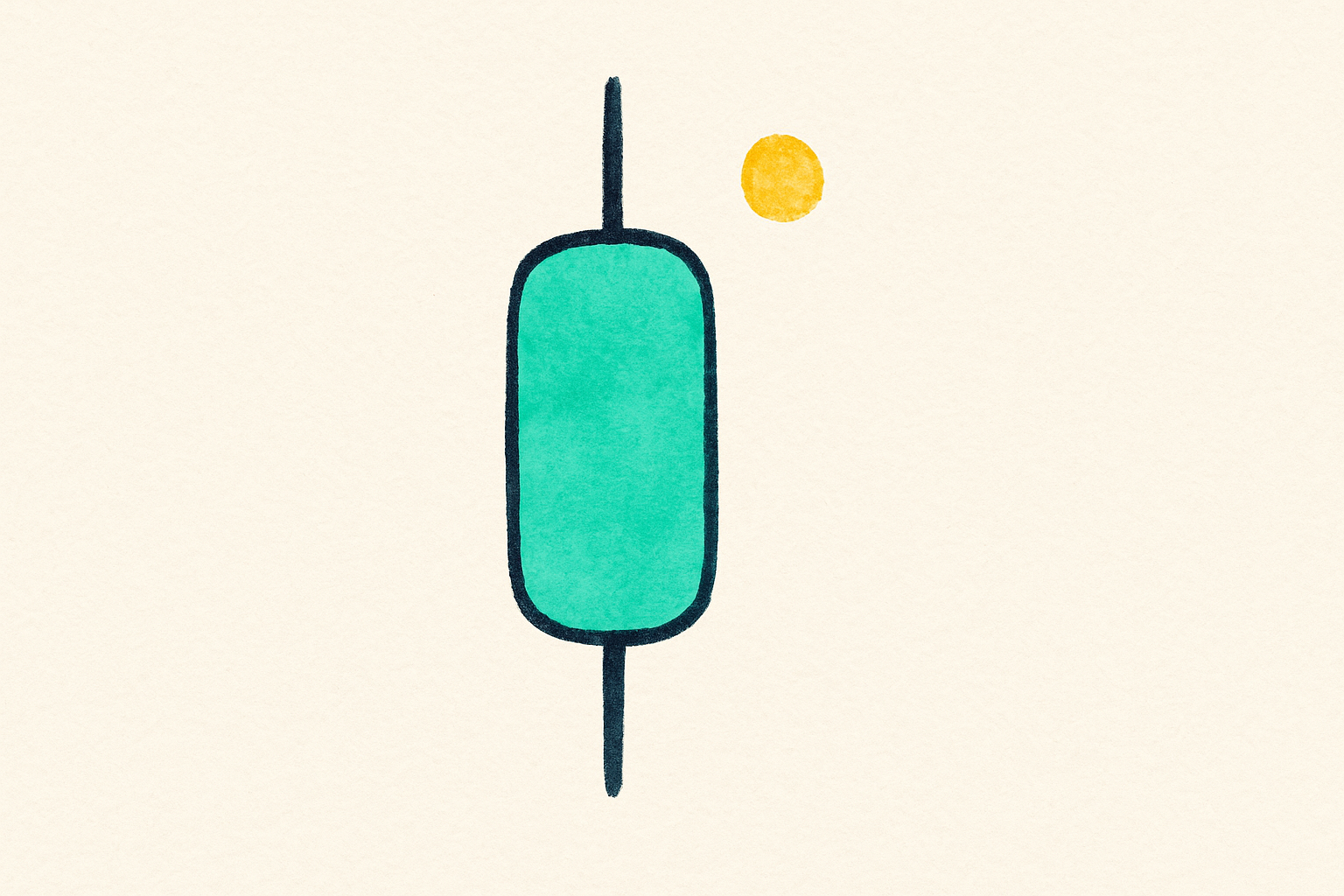
Here’s the heart of learning how to read a crypto chart. Every candle records four prices for one period of time: the open, the high, the low, and the close.
The open is the price when the period started. The close is the price when it ended. The high is the most the price reached during that period, and the low is the least it reached. One candle might represent a minute, an hour, a day, or a week, depending on the timeframe you’ve picked (more on that soon).
A candle has two parts. The thick middle section is called the body, and it stretches between the open and the close. The thin lines poking out of the top and bottom are the wicks (some people call them shadows), and they reach to the high and the low.
So a single candle tells you where the price started, where it ended, and how far it wandered in both directions along the way. That’s a surprising amount of information in one small shape.
Green candles and red candles
Color is the fastest read on any chart. A green candle means the price closed higher than it opened during that period. Buyers were in control. A red candle means the price closed lower than it opened. Sellers had the upper hand.
The color only compares the open and the close of that one candle. It doesn’t tell you whether the price is up or down over the whole week, and it doesn’t mean the asset is “good” or “bad.” A string of green candles just means the price kept closing higher period after period.
Some charts let you change the colors, so always check which color means up on the chart you’re using. Green up and red down is the common default, but it isn’t a law.
The wicks tell you the real story
The body shows the calm summary, but the wicks show the drama. Imagine a coin opened at one price and closed a little higher, giving you a small green body. On its own that looks quiet. But if there’s a long wick sticking down below the body, it means the price dropped hard during that period before buyers pushed it back up before the close.
A long lower wick means price traveled well below the body and then recovered. A long upper wick means price shot up but got pushed back down before the candle closed. Big wicks are a sign of a tug of war between buyers and sellers, and they’re easy to miss if you only look at the colors.
You don’t need to memorize the dozens of named candle patterns that trading sites love to list. Just training your eye to notice long wicks will teach you more about market mood than most of those patterns ever will.
Timeframes change everything
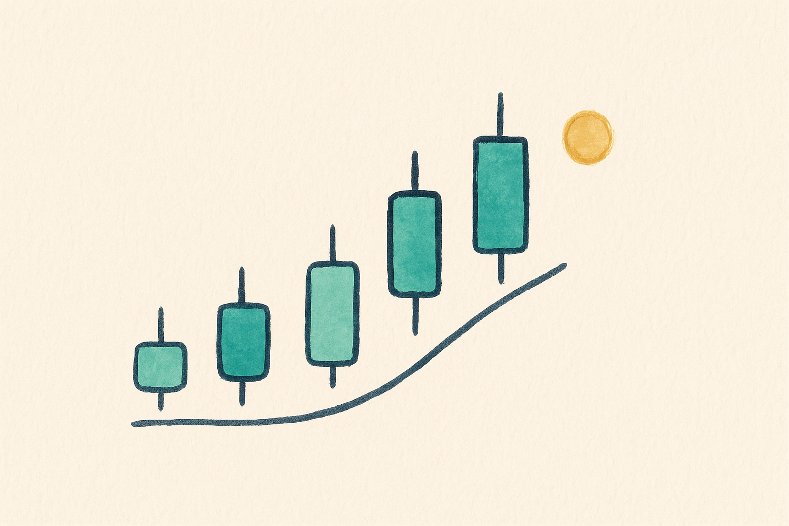
Here’s the part that trips up almost every beginner. The same chart can look totally different depending on the timeframe you choose, and that setting is usually a small button near the top of the chart.
On a one minute timeframe, each candle is a single minute, so a day’s worth of candles looks jumpy and chaotic. On a daily timeframe, each candle is a full day, and the same period looks far smoother and calmer. Neither one is more “true.” They’re just different zoom levels on the same price history.
If you’re new, the shorter timeframes will make you anxious for no good reason. A one minute chart is a firehose of tiny moves that mostly cancel out. Zooming out to a daily or weekly view gives you the bigger, calmer picture, which is usually far more useful for someone who isn’t day trading.
Volume, in plain terms
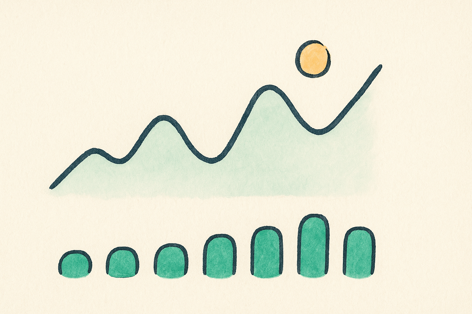
Below the candles you’ll often see a row of small bars. That’s volume, and it simply measures how much of the asset was traded during each period. Tall bars mean lots of trading activity, short bars mean quiet.
Volume is useful as a gut check. A big price move on high volume means a lot of people were involved, so the move has more weight behind it. The same size move on tiny volume can be thin and easy to reverse. You don’t need to overthink it as a beginner, but it’s handy context sitting right under the price.
Common beginner traps to avoid
The biggest mistake new chart readers make is reading meaning into noise. On short timeframes, the price wiggles constantly, and it’s tempting to see a pattern in every little bump. Most of those wiggles mean nothing at all.
The second trap is believing a chart can predict the future. It can’t. A chart is a record of what already happened, not a crystal ball. Patterns that “worked” last month can fail the next, and no chart shape guarantees where the price goes next. Anyone who tells you otherwise is selling something.
The third trap is staring at charts all day and letting the green and red flashes drive your emotions. Crypto is volatile, prices can swing hard in both directions, and watching every candle is a fast track to stress and rushed decisions. Set the chart to a longer timeframe, check it far less often, and your nervous system will thank you.
Key takeaways
Reading a crypto chart comes down to a few simple ideas. A candlestick shows the open, high, low, and close for one period. Green means the price closed up, red means it closed down. The body is the open to close range, and the wicks show how far price traveled beyond that. Timeframes are just zoom levels, and volume shows how much trading backed a move.
Learn those, and you’ll understand most of what a chart is telling you. Everything fancier (indicators, named patterns, drawing tools) is optional and sits on top of these basics. That’s really the whole of how to read a crypto chart at a beginner level. Start simple, zoom out, and don’t mistake a record of the past for a prediction of the future.
Want more grounding before you dive in? Read our plain English breakdown of Bitcoin vs Ethereum, or browse the rest of our Markets explainers.
Frequently asked questions
What do the colors on a crypto chart mean?
On the common default, a green candle means the price closed higher than it opened for that period, and a red candle means it closed lower. The color only compares that single candle’s open and close, so always confirm which color means up on the chart you’re using.
What timeframe should a beginner use?
Daily or weekly candles are the friendliest starting point. They smooth out the constant noise of shorter timeframes and give you the bigger picture without the anxiety of watching every tiny move. You can always zoom in later once you’re comfortable.
Can a crypto chart predict the price?
No. A chart records what already happened. It can help you understand past behavior and current mood, but it cannot tell you where the price goes next. Treat anyone promising guaranteed predictions with heavy skepticism.
What are the wicks on a candlestick?
Wicks (also called shadows) are the thin lines above and below the candle body. They reach to the highest and lowest prices during that period. A long wick means the price traveled far in that direction before snapping back before the close.
Do I need to learn candlestick patterns?
Not to get started. Understanding the anatomy of a single candle, plus timeframes and volume, covers most of what you need. Named patterns are optional extras, and none of them guarantee a result, so don’t treat them as sure things.
This article is general information about how crypto charts work, not financial, investment, or trading advice. Crypto is volatile and you can lose money. Only risk what you can afford to lose, and make your own decisions. Details were verified on the publish date.